There is a moment in the Scottish Highlands when autumn takes hold and the landscape burns. Bracken turns to copper, rowan berries glow like embers against dark bark, and the low afternoon sun paints everything in shades of amber and gold. These are the warm colours that have captivated Scottish artists for generations, and they continue to shape some of the most compelling contemporary painting coming out of Scotland today.
Warm colours in art, the reds, oranges, yellows, and golds that occupy one half of the colour wheel, carry an immediate emotional charge. They advance toward the viewer, create energy, and draw the eye with an urgency that cooler tones simply do not match. Understanding how artists use warm colour palettes, and what makes warm tones so powerful, will deepen both your appreciation of art and your confidence when choosing pieces for your own space.
This guide explores the role of warm colours in contemporary Scottish art, from the science of why they affect us so strongly to the ways Scottish artists translate the warmth of their landscape into paint on canvas.
In this guide:
Warm and Cool Colours in Art: Understanding the Contrast
Warm Colours in Contemporary Scottish Art
The Emotional Impact of Warm Colours
Choosing Warm-Toned Art for Your Home
-
-
Warm and Cool Colours in Art: Understanding the Contrast
The interplay between warm and cool colours is one of the most fundamental tools in a painter’s vocabulary. Where warm colours (reds, oranges, golds) advance and energise, cool colours (blues, greens, purples) recede and calm. Together, they create the visual tension and harmony that gives paintings their depth and emotional complexity.
In landscape painting, this contrast is essential for creating a sense of distance. Warm foreground colours give way to increasingly cool tones in the middle ground and background, mimicking the natural atmospheric effect where distant objects take on bluish hues. Scottish landscape painters use this principle instinctively, setting warm heather and bracken against cool distant mountains to create paintings that feel genuinely spatial and immersive.
The warm-cool contrast also carries emotional weight. A painting dominated by warm tones with just a sliver of cool blue sky creates a feeling of sheltered intimacy, whilst a predominantly cool painting with a warm focal point, perhaps a lit window or a setting sun, draws the viewer’s attention with quiet intensity. Understanding this interplay helps you recognise what makes certain paintings feel balanced, dynamic, or deliberately unsettling.
Temperature in colour is also relative rather than absolute. A warm red can feel cool when placed beside an even warmer orange, and a cool green can feel warm when surrounded by icy blues. Scottish artists working with the country’s naturally muted palette are particularly skilled at navigating these subtle temperature shifts, creating warmth through relative colour relationships rather than through vivid, saturated hues alone.
Warm Colours in Contemporary Scottish Art
Scotland’s landscape might be more commonly associated with cool greens, greys, and blues, but warm colours play an equally vital role in the country’s artistic identity. The Scottish palette includes warm tones that are distinctive and deeply rooted in the land itself: the terracotta of Highland earth, the gold of late summer barley fields, the rich amber of whisky-coloured peat water, and the burning orange of autumn hillsides.
The Warmth of Scottish Landscape
Contemporary landscape painters working in Scotland find warm colours in every season, not only in autumn’s obvious palette. Spring brings the warm yellows of gorse blazing across hillsides. Summer offers golden light on sandstone cliffs and the warm undertones of sun-baked grass. Even winter provides warm moments: the pink and amber glow of short winter sunrises, the terracotta tones of bare birch bark against snow.
Artists like Rose Strang capture these warm landscape moments with expressive, energetic brushwork. Strang’s paintings often explore the interplay between warm foreground elements and cooler atmospheric backgrounds, creating a sense of being present within the landscape rather than merely observing it. Her palette shifts with the seasons and locations she paints, but warm earth tones and golden light frequently anchor her compositions.
-
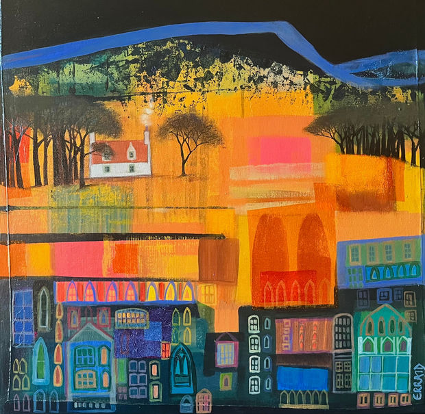
 Erraid GaskellAcrylic and tissue paperGlow of the GlenFramed Size: 54 x 54 cm£ 1,125.00
 -
The Emotional Impact of Warm Colours
The emotional power of warm colours is rooted in both biology and culture. We associate warm tones with fire, sunlight, and physical warmth, responses that run deeper than conscious thought. In art, these associations translate into immediate emotional effects that artists harness deliberately.
Red, the most intense warm colour, commands attention and creates urgency. It can signify passion, vitality, or danger depending on context. In Scottish art, red appears in the drama of Highland sunsets, the jewel-like intensity of rowan berries, and the rich earth tones of iron-stained rock. Artists use red sparingly in landscape painting, knowing that even a small passage of red will dominate a composition.
Orange and amber carry warmth without red’s intensity, creating feelings of comfort, energy, and optimism. These are the colours of autumn’s most generous moments, of firelight and golden hour. In contemporary Scottish painting, orange and amber tones often appear in transitional moments: sunrise, sunset, the turning of seasons.
Gold and ochre create a sense of richness and permanence. These earth tones feel grounded and enduring, connecting viewers to the ancient geology of the Scottish landscape. Gold tones in painting can evoke both material richness and the spiritual quality of light itself, which is why they appear so frequently in paintings that seek to capture transcendent landscape moments.
Yellow, the lightest warm colour, carries optimism and vitality. In Scottish art, yellow appears most naturally in spring (gorse, buttercups, primroses) and in the quality of summer light at northern latitudes, where even bright sunshine has a warm, golden cast quite different from the harsh white light of southern climates.
Choosing Warm-Toned Art for Your Home
Warm-coloured artwork can transform the atmosphere of a room. Because warm colours advance visually, they create a sense of intimacy and enclosure that works particularly well in living rooms, dining rooms, and spaces designed for social gathering. A warm-toned painting on a prominent wall draws people in and creates a natural focal point for conversation.
Consider the existing colour temperature of your space when choosing warm art. Rooms with cool-toned walls (greys, whites with blue undertones, pale blues) benefit particularly from warm artwork, which creates a complementary contrast that energises the space. Rooms already decorated in warm tones can be enriched by paintings that echo and extend that warmth, though be mindful of balance: too much warmth without any cool counterpoint can feel overwhelming.
Lighting plays an important role in how warm colours appear. Natural daylight reveals the full range of warm tones, whilst incandescent lighting (already warm in temperature) can intensify warm colours further. LED lighting with a cooler colour temperature can slightly mute warm tones, so it’s worth considering your lighting when selecting artwork. This is one reason why seeing art in your own space before committing is so valuable.
Scale matters with warm art. A large painting in rich warm tones can serve as the defining element of a room, whilst smaller warm-toned pieces work beautifully in more intimate settings: hallways, reading nooks, bedside walls. For guidance on sizing and placement, explore our guide to choosing art for your home.
At Graystone Gallery, we offer personal guidance to help you find warm-toned artworks that suit both your aesthetic preferences and your space. Our flexible payment options make it easier to invest in pieces that will bring lasting warmth and character to your home.
Browse our collection to discover warm-toned artworks by contemporary Scottish artists.
Developing Your Appreciation of Warm Colours in Art
Training your eye to notice warm colour relationships is one of the most rewarding aspects of developing your visual language. Start by paying attention to how warm colours appear in the natural world around you. Scotland’s landscape offers endless opportunities: notice the warm tones in sandstone buildings, the amber quality of evening light on water, the way autumn transforms a hillside into a tapestry of copper, gold, and russet.
When viewing paintings, observe how artists handle warm colours. Do they use them broadly across the canvas, or as strategic accents within a cooler composition? Is the warmth vivid and saturated, or muted and earthy? These choices reveal different artistic intentions and create very different emotional effects. Comparing approaches helps you understand your own warm colour preferences.
Visit galleries to experience warm colours in person. Reproductions on screens tend to flatten the subtle variations within warm palettes, losing the textural depth and tonal complexity that make warm-toned paintings so compelling in the flesh. Standing before a painting where layers of warm colour build luminous depth is an experience that no screen can replicate.
Ready to explore warm colours in contemporary Scottish art? Visit Graystone Gallery in Edinburgh’s Stockbridge to discover how Scotland’s artists capture the reds, oranges, and golds of this remarkable landscape.
Explore our full collection or contact us to arrange a visit.
Frequently Asked Questions
What are warm colours in art?
Warm colours are those on the red, orange, and yellow side of the colour wheel, including earth tones like burnt sienna, ochre, and amber. They are associated with fire, sunlight, and physical warmth, and they tend to advance visually toward the viewer, creating energy and immediacy in a painting.
What is the difference between warm and cool colours in art?
Warm colours (reds, oranges, yellows, golds) advance visually and create feelings of energy and intimacy. Cool colours (blues, greens, purples) recede and evoke calm and spaciousness. Artists use the contrast between warm and cool tones to create depth, direct the viewer’s eye, and build emotional complexity within compositions.
Why do warm colours feel so energetic?
Warm colours are associated with fire and sunlight, triggering responses that run deeper than conscious thought. Optically, warm colours have longer wavelengths that our eyes process differently from cool colours, and they appear to advance toward the viewer. These combined effects create the sense of energy and proximity that warm-toned paintings carry.
How do Scottish artists use warm colours?
Scottish artists find warm colours in the Highland earth tones, autumn foliage, golden gorse, sandstone architecture, and the amber quality of low northern light. Rather than relying on vivid, saturated warm hues, many Scottish painters work with nuanced, muted warmth that reflects the country’s atmospheric light conditions.
Where should I hang warm-toned artwork?
Warm-toned paintings work particularly well in living rooms, dining rooms, and social spaces where their energy and intimacy enhance the atmosphere. They create effective focal points on prominent walls and pair well with cool-toned interiors for complementary contrast. Consider your room’s natural light when placing warm artwork, as lighting significantly affects how warm colours appear.
Can warm and cool colours work together in my art collection?
Absolutely. Most successful art collections include both warm and cool-toned pieces, creating visual variety and emotional range across different rooms. The key is considering the mood you want each space to carry and choosing colour temperatures that support that intention. For more guidance, read our complete guide to colour in art.