Colour is the first thing we respond to when we encounter a work of art. Before we register subject matter, brushwork, or composition, colour reaches us, creating an immediate emotional connection that shapes everything that follows. Understanding colour in art doesn’t require specialist knowledge; it simply means learning to trust and explore those instinctive responses.
In contemporary Scottish art, colour takes on a particular richness and complexity. Scotland’s ever-changing light, dramatic landscapes, and atmospheric conditions create a natural palette that has inspired artists for centuries, from the warm golds of autumn bracken to the cool blue-greys of coastal mist. Today’s Scottish artists continue this tradition, using colour not merely to represent what they see, but to capture what they feel.
This guide explores how colour works in art, what it means, and why it matters, with a particular focus on contemporary Scottish artists who demonstrate the extraordinary power of colour in their practice. Whether you’re a seasoned collector or simply curious about why certain paintings stop you in your tracks, understanding colour will deepen your appreciation and confidence when engaging with art.
In this guide:
Understanding Colour Theory in Art
How Scottish Artists Use Colour
Choosing Art by Colour for Your Space
-
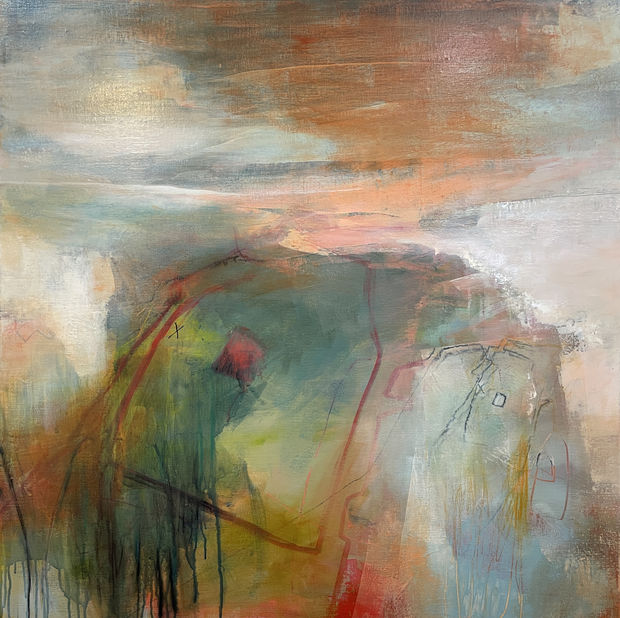
 Kerry SouterAcrylic and mixed media on canvasAlmost HomeFramed Size: 103 x 103 cm
 -
Understanding Colour Theory in Art
Colour theory in art provides a framework for understanding how colours relate to one another and why certain combinations create particular visual effects. While it might sound academic, the basics of colour theory are intuitive. Most of us already respond to colour relationships without being able to name them.
The Colour Wheel and Key Relationships
The colour wheel organises colours by their relationships: primary colours (red, blue, yellow) combine to create secondary colours (orange, green, purple), which in turn blend into tertiary colours. From this simple structure, several key relationships emerge that artists use constantly in their work.
Complementary colours sit opposite each other on the wheel, such as blue and orange, red and green, or yellow and purple. When placed side by side, complementary colours intensify each other, creating visual energy and vibrancy. Many Scottish landscape painters exploit the complementary relationship between green hillsides and reddish-brown heather to create paintings that feel alive with colour tension.
Analogous colours sit beside each other on the wheel, such as blue, blue-green, and green. These combinations feel naturally harmonious and are often found in atmospheric Scottish landscapes where sea, sky, and shoreline blend into one another through closely related hues.
Warm and cool colours divide the wheel into two emotional territories. Warm colours (reds, oranges, and yellows) tend to advance visually and create energy, whilst cool colours (blues, greens, and purples) recede and evoke calm. Understanding this distinction is particularly useful when choosing art for specific spaces in your home.
Value, Saturation, and Tone
Beyond the colour wheel, three properties shape how we experience colour in a painting. Value describes how light or dark a colour is: a pale sky blue and a deep navy are the same colour at different values. Saturation refers to a colour’s intensity or purity, comparing a vivid scarlet with a muted, earthy red. Tone combines these qualities to describe the overall feeling a colour carries.
Scottish artists frequently work with desaturated, tonal palettes that reflect the country’s atmospheric light conditions. The soft greys, muted greens, and gentle blues characteristic of much Scottish painting aren’t limitations. They’re sophisticated colour choices that capture the particular quality of northern light filtering through cloud and mist.
-
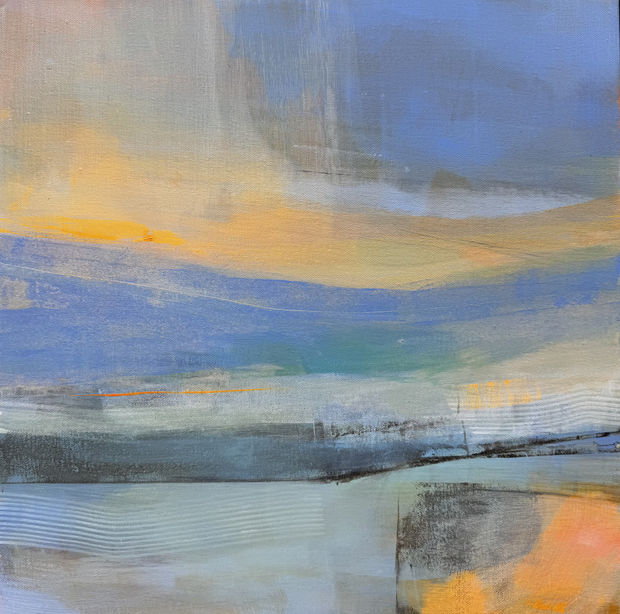
Madeleine GardinerOil on canvasSea FoamFramed Size: 44 x 44 cm
-
Personal Colour Response
While cultural associations provide useful context, your personal response to colour is equally valid and important. You might find that certain blues energise rather than calm you, or that greens feel melancholy rather than refreshing. These individual responses form part of what we call your visual language, the unique way you respond to visual elements in art.
Developing awareness of your colour preferences is one of the most practical steps you can take toward building a collection that truly speaks to you. Notice which colour palettes draw you in across different artworks. Patterns will emerge that help you understand what resonates most deeply.
Colour and Emotion in Art
The relationship between colour and emotion is direct and powerful. Artists have long understood that colour bypasses rational thought to create immediate feeling, which is precisely why abstract art, which communicates primarily through colour and form, can be so profoundly moving even without recognisable subject matter.
Warm colour palettes, built around reds, oranges, and golds, tend to create feelings of energy, intimacy, and warmth. A painting dominated by warm tones can make a room feel more inviting and alive. Cool palettes, centred on blues, greens, and purples, often evoke contemplation, calm, and spaciousness, making them natural choices for rooms where you seek rest or focus.
But the most emotionally complex paintings often work at the boundary between warm and cool, creating tension and resolution within a single canvas. A Scottish landscape painter might set warm foreground bracken against cool distant mountains, creating a sense of depth that mirrors the emotional journey of the eye through the scene. An abstract artist might push complementary colours against one another to create visual energy that slowly resolves into harmony the longer you look.
This emotional power is why colour is such an important consideration when choosing art. The right colour relationships don’t just complement your interior. They create the emotional atmosphere you want to live within.
Explore our collection of abstract artworks to experience the emotional power of colour firsthand.
-
Rose StrangMixed media on wood panelHunter's Loch, Edinburgh WinterFramed size: 28.5 x 28.5 cm
-
Colour in Scottish Glass Art
Colour in art extends well beyond the painted canvas. Elin Isaksson, a glass artist working from her studio in Dunblane, creates hand-blown and cast glass pieces that explore colour through an entirely different medium. Her subtle blended colour palettes reflect a Scandinavian minimalist aesthetic enriched by the Scottish landscape, with soft gradations that shift as light passes through each piece. Isaksson’s work demonstrates how colour can be experienced in three dimensions, transparent, translucent, and reflective, changing throughout the day with the movement of natural light.
-
Poppy CysterMixed media on box canvasSpindrift 2Unframed size: 45 x 46 cm
-
Ellis O’ConnorOil on deep box canvasSalt EarthUnframed Size: 50 x 100 cm
-
Ben LucasOil on canvasAscensionFramed Size: 80 x 104 cm
-
Choosing Art by Colour for Your Space
Understanding colour in art has an immensely practical application: it helps you choose paintings that will not only complement your interior but actively enhance the atmosphere of your home or workplace.
Think about the mood you want to create. A living room designed for sociable evenings might benefit from warm-toned paintings that create energy and conversation, whilst a bedroom might call for cooler, more contemplative palettes. Studies and home offices often work well with tonal, atmospheric pieces that promote focus without distraction.
Consider how light changes in your space throughout the day. A painting with subtle colour gradations will reveal different qualities in morning light versus evening lamplight, creating a work that evolves with your daily routine. Many collectors find this shifting quality one of the great pleasures of living with art.
Colour relationships between artwork and interior design need not be exact matches. In fact, the most successful pairings often involve complementary or analogous colour relationships rather than direct matching. A painting with deep blue-green tones can create a sophisticated conversation with warm wooden furniture, whilst a warm ochre landscape might beautifully offset cool grey walls.
At Graystone Gallery, we offer flexible payment options including the OwnArt interest-free instalment scheme, making it easier to invest in the colours that speak to you. For detailed guidance on placement and scale, explore our complete guide to choosing art for your home.
Browse our full collection to discover artworks in the colour palette that speaks to you.
Developing Your Eye for Colour in Art
Like any skill, sensitivity to colour deepens with practice and exposure. The more attention you pay to colour, in art, in nature, in your everyday surroundings, the more naturally you’ll respond to the colour choices artists make.
Visit galleries regularly. Seeing paintings in person reveals colour relationships that simply cannot be captured on screen. The way pigments interact with gallery lighting, the textural depth of layered colour, the subtle shifts visible only at close range: these are experiences unique to standing before an original work.
Notice how different artists working from similar subjects make entirely different colour decisions. Two painters standing before the same Highland vista will produce dramatically different palettes, each reflecting their personal response to the scene. Comparing these approaches helps you understand how colour carries artistic intention and personality.
Pay attention to the colours that move you in everyday life: the particular green of new spring leaves, the colour of the sky at dusk, the warmth of firelight. These responses are the foundation of your visual language, and they translate directly to your art preferences.
Ready to explore colour in contemporary Scottish art?
Visit Graystone Gallery in Edinburgh’s Stockbridge to experience our curated collection in person. Our diverse selection spans rich warm tones, atmospheric blues and greys, and the full spectrum of Scotland’s remarkable green palette, offering something for every colour sensibility.
Explore our collection online or contact us to arrange a gallery visit.
Frequently Asked Questions
What is colour in art?
Colour in art refers to how artists use pigment, light, and visual relationships to create mood, meaning, and emotional impact. It encompasses everything from the specific hues an artist chooses to the way those colours interact within a composition, creating the visual language through which a painting communicates.
What is colour theory in art?
Colour theory is a framework that explains how colours relate to one another through the colour wheel, complementary and analogous relationships, and the properties of value, saturation, and tone. Artists use colour theory both consciously and intuitively to create harmonious or deliberately contrasting palettes.
What does colour mean in art?
Colour carries cultural, psychological, and personal meaning. Red might suggest passion or urgency, blue can evoke calm or melancholy, green speaks of nature and renewal. However, colour meaning is never fixed. Context, personal experience, and artistic intention all influence how we interpret colour in any given work.
How do artists use colour to convey emotion?
Artists use colour temperature (warm or cool), saturation (vivid or muted), and contrast (high or subtle) to create emotional responses. Warm, saturated palettes tend to energise and excite, whilst cool, desaturated tones often calm and contemplate. The most emotionally rich paintings frequently play warm and cool tones against one another.
Why is colour so important in Scottish art?
Scotland’s unique light conditions (long, low-angled northern light, rapidly changing weather, and atmospheric effects like haar and mist) create a natural colour palette of extraordinary richness and subtlety. Scottish artists have developed distinctive approaches to colour that capture these specific qualities, making colour central to the identity of contemporary Scottish art.
How should I choose art based on colour?
Consider the mood you want to create in your space, how natural light moves through the room, and the existing colour relationships in your interior. Art doesn’t need to match your décor; complementary or analogous colour relationships often work best.