Stand on any Scottish headland and look out to sea. The blues you see will be nothing like the blues of the Mediterranean or the Caribbean. Scottish blue is complex, layered, and ever-shifting: steel grey one moment, pale silver the next, deepening to indigo as clouds gather, then breaking open to a luminous, cold clarity that takes your breath away. This is the blue that Scottish artists know and paint, and it is unlike blue anywhere else in the world.
Blue holds a unique place in the history of art. For centuries it was the most precious pigment available, more costly than gold, reserved for the most sacred subjects. That historical weight lingers in blue’s emotional associations: depth, contemplation, infinity, the spiritual. But blue is also the colour of everyday Scottish experience, of sea and sky and the particular atmospheric haze that softens distant mountains into violet-grey silhouettes.
This guide explores blue in contemporary Scottish art, from the science of why blue affects us so profoundly to the ways Scotland’s artists use blue to capture the country’s distinctive light, coastline, and atmosphere. Whether you are drawn to dramatic seascapes, contemplative abstracts, or atmospheric landscapes, understanding blue will transform the way you see and respond to art.
In this guide:
What Does Blue Represent in Art?
Cool Colours in Art: Blue and Its Companions
Scotland’s Blues: A Palette Shaped by Light and Sea
Abstract Art in Blue: Colour Without Boundaries
Blue Wall Art: Choosing Blue Paintings for Your Home
-
 Louise LacailleOil on canvasPathfinderFramed Size: 53.5 x 43.5 cm
 -
Cool Colours in Art: Blue and Its Companions
Blue sits at the heart of the cool colour family, alongside green and purple. These colours share a quality of visual recession: they appear to move away from the viewer, creating depth and openness. This is the opposite effect to warm colours (reds, oranges, golds), which advance toward the eye and create intimacy.
Understanding the interplay between cool and warm colours is essential to appreciating how blue functions in painting. A landscape dominated by cool blues with a single passage of warm colour, perhaps a sunlit cottage or a strip of golden sand, creates a powerful focal point precisely because of the temperature contrast. The warm element sings against its cool surroundings, drawing the eye with magnetic intensity.
Within the cool family, blue varies enormously in temperature. A blue leaning toward purple (ultramarine, cobalt) feels warmer than a blue leaning toward green (cerulean, phthalo). Scottish artists exploit this range constantly: the warm blue of a winter sunset sky feels entirely different from the cold blue-green of deep water, even though both are technically blue. Learning to notice these temperature shifts within blue is one of the most rewarding aspects of developing a sensitive eye for colour in art.
Cool colours also carry a quality of stillness that warm colours rarely achieve. A room hung with predominantly cool-toned paintings feels quieter and more contemplative than one dominated by warm tones. This quality makes blue and its cool companions particularly well suited to spaces designed for rest, thought, and reflection.
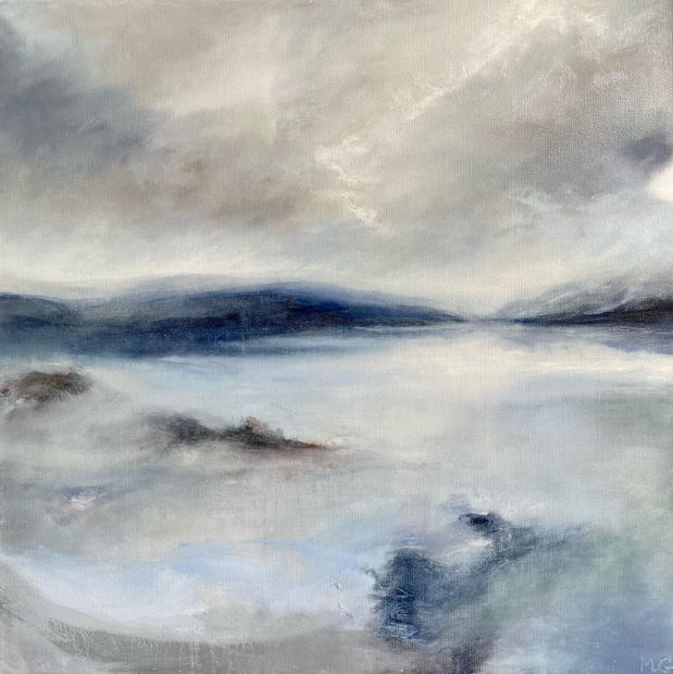
Scotland’s Blues: A Palette Shaped by Light and Sea
Scotland’s relationship with blue is shaped by geography, climate, and latitude. Surrounded on three sides by sea, crossed by countless rivers and lochs, and subject to weather systems that arrive from the Atlantic in endless variety, Scotland offers artists a blue palette of extraordinary range and complexity.
-
Madeleine GardinerOil on canvasLuskentyre After RainUnframed Size: 50 x 50 cm£ 650.00
-
Artists like Madeleine Gardiner capture these atmospheric blues with particular sensitivity. Gardiner’s landscape paintings frequently use blue to build spatial depth, with cool, muted blues in the distance gradually giving way to warmer, more defined tones in the foreground. This careful orchestration of blue creates paintings that feel genuinely expansive, drawing the viewer’s eye deep into the landscape.
How Scottish Artists Use Blue
Blue in Landscape Painting
In Scottish landscape painting, blue serves multiple functions simultaneously. It creates distance through atmospheric perspective, establishes the mood and weather conditions of a scene, and provides the cool counterpoint against which warm elements can sing. A skilled landscape painter uses blue not as a single colour but as a family of related tones, each carefully calibrated to its position and purpose within the composition.
The mixing of landscape blues is a subtle art. Few painters use blue straight from the tube; instead, they modify blues with touches of grey, green, purple, or even warm earth tones to achieve the specific atmospheric quality they seek. A Highland distance might require blue mixed with grey and a touch of raw umber, whilst a summer sky might call for blue warmed with the faintest touch of yellow.
-
Lesley OldakerOil on canvasA Safe PlaceFramed Size: 80 x 80 cm
-
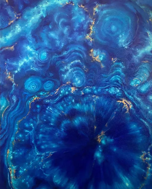
Abstract Art in Blue: Colour Without Boundaries
Blue is one of the most powerful colours in abstract art. Freed from the need to represent sky or sea, blue in abstraction can explore pure emotional and visual territory: depth without distance, calm without landscape, infinity without horizon.
Contemporary Scottish abstract artists working with blue create pieces that resonate with the country’s atmospheric qualities without depicting any specific place. A deep blue abstract might evoke the feeling of looking into deep water, or the vast stillness of a clear winter sky, or simply the contemplative quality that blue carries in its own right. These associations arise naturally from the colour itself, without the artist needing to direct them.
Abstract art in blue spans an enormous emotional range. Pale, luminous blues create a sense of openness and peace. Deep, saturated blues feel immersive and contemplative. Blue-greens carry the freshness of coastal air, whilst blue-purples suggest twilight and introspection. The particular blue an artist chooses, and the way they set it against other colours, determines the emotional character of the work entirely.
For collectors, blue abstract art offers the emotional qualities of blue without the specificity of a representational scene. This can make blue abstracts particularly versatile in interior settings, where they provide atmosphere and colour without competing with or contradicting the room’s existing character.
Blue Wall Art: Choosing Blue Paintings for Your Home
Blue paintings bring qualities of calm, spaciousness, and contemplation into domestic settings. Because blue recedes visually, blue art can make rooms feel larger and more open, a quality particularly valuable in smaller spaces or in rooms where you want a sense of breathing room.
Consider which blues resonate with you when choosing art for your home. Cool, grey-tinged blues (the blues of overcast sea, distant mountains, winter sky) create quiet, meditative atmospheres. Warm blues (those leaning toward purple or violet) feel richer and more enveloping. Bright, clear blues bring freshness and energy, whilst muted, desaturated blues offer subtlety and sophistication.
Blue paintings work particularly well in bedrooms, where their calming qualities support rest and sleep. They are also effective in studies and home offices, where the contemplative quality of blue promotes focus without the distraction that warmer, more energetic colours can create. In living rooms, blue art provides a cool counterpoint to warm furnishings and lighting, creating a balanced colour conversation.
The relationship between blue art and natural light deserves special attention. Blue paintings can appear dramatically different under warm incandescent light versus cool daylight: warm lighting warms blue tones slightly, whilst cool daylight reveals their full range. North-facing rooms, which receive cooler light, will emphasise the cool qualities of blue paintings, whilst south-facing rooms soften and warm them. Consider your room’s orientation when choosing blue art.
Scale also matters with blue paintings. Large blue works can create an immersive, almost environmental effect, surrounding the viewer with colour in a way that transforms the room’s atmosphere entirely. Smaller blue pieces, including works from our small paintings collection, create quieter, more intimate focal points. For comprehensive guidance on sizing and placement, explore our guide to choosing art for your home.
Graystone Gallery offers flexible payment options including OwnArt interest-free instalments, making it easier to bring the blues of Scotland’s seas and skies into your home.
Browse our collection to discover blue artworks by contemporary Scottish artists.
-
Hetty HaxworthScreenprintBlue IntersectionUnframed size: 57 x 100 cmEdition of 25
-
Frequently Asked Questions
What does blue represent in art?
Blue represents depth, calm, contemplation, and the infinite. Historically associated with the sacred and the precious, blue in contemporary art evokes a wide range of emotions from serene peace to profound melancholy. Its specific meaning depends on tone, context, and the viewer’s personal associations.
What are cool colours in art?
Cool colours are those on the blue, green, and purple side of the colour wheel. They are associated with water, sky, and shadow, and they tend to recede visually, creating a sense of space and depth. Cool colours generally evoke calm and contemplation, in contrast to warm colours (reds, oranges, golds) which advance and energise.
What is abstract art in blue?
Abstract art in blue uses blue tones to explore pure emotional and visual effects without depicting recognisable subjects. Blue abstracts can evoke feelings of depth, calm, vastness, or introspection through colour relationships and composition alone, drawing on blue’s natural associations with sea, sky, and contemplative space.
How do Scottish artists approach blue differently?
Scottish artists work with a blue palette shaped by the country’s distinctive northern light, Atlantic weather systems, and coastal geography. Scottish blues tend to be more complex, grey-tinged, and variable than the warmer blues of southern European painting. Artists develop sophisticated mixing techniques to capture the particular steely, atmospheric blues of Scottish sea, sky, and mountain.
Where should I hang blue artwork?
Blue paintings suit bedrooms (promoting calm and rest), studies (supporting focus and contemplation), and living rooms (providing cool counterpoint to warm furnishings). Consider your room’s natural light orientation: north-facing rooms emphasise blue’s cool qualities, whilst south-facing rooms soften them with warmer light.
How do I choose between different blues?
Pay attention to which blues you respond to emotionally. Cool grey-blues create quiet meditation, warm purple-blues feel enveloping, bright clear blues bring freshness, and muted blues offer sophistication. Your instinctive colour responses are a reliable guide. For more on developing your colour preferences, explore our complete guide to colour in art.